
10년전 애플이 아이튠스를 처음 내놓았을때. 한국엔 MP3가 막 도입되던 시기 (지금에 비하면 고가에 저급한 수준의 제품)
그런시절에 애플은 아이팟을 내놓고, 온라인상에서 음악을 돈 받고 팔겠다고 했다. (그땐 그냥 다 카피하거나 불법다운로드로 들었다.)
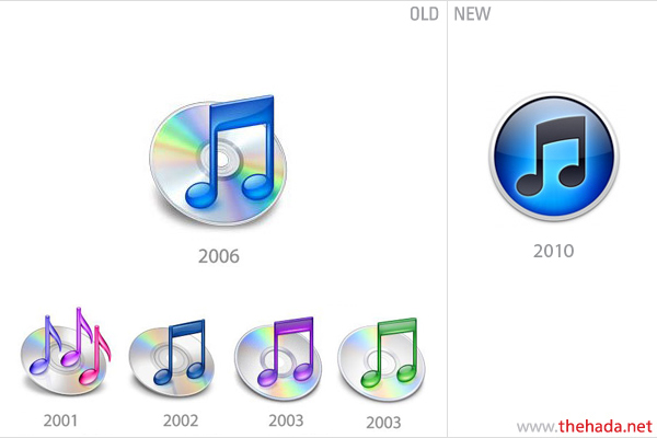
CD를 만들어 팔던 음악시장에서도 음질이 좋질 않다느니, 보관할수 없다느니 하는 생(?) 트집들을 잡아대며 MP3 시장을
밀어내려했지만, 10년이 채 안지난 지금 CD시장은 온데 간데 없다. 그런 변화에 발 맞춰 애플의 아이튠스도 아이콘 디자인에서
CD를 빼버리고, 지구같은 원형홀에 음표만을 남겨뒀다. 가상의 공간에서 다운받는 음악의 세계를 표현이라도 하듯
시대 흐름에 따른 아이콘의 변화는 기존의 아이덴티티를 유지하면서 의미 전달면에서 확실한 변화를 준다.
2010© TheHADA Design Institute
On the 13th of July 1998, Jeff Robbin, Bill Kincaid, and Dave Heller released the first version of SoundJam MP. Two years later, the developers of SoundJam sold their software to Apple, and continued development (in secrecy, as is typical of Apple) of the software for the Cupertino based company. In 2001, iTunes was released and, to this day, Jeff Robbin continues to guide the direction of iTunes under the ever watchful eye of Steve “boom boom” Jobs. All was going great. That is until the latest update, when they decided to substantially redesign the application icon.
Released last Thursday, the decision to ditch the antiquated Compact “I haven’t bought one in 6 years” Disc and focus the icon on the music note, has caused quite the uproar. The new version of the icon seems to be following the standard “more is more” approach of on screen design: drop shadows, glows, bevels, gradients? We got ‘em all! Even the much lauded simplicity of Adobe’s icon set for the crash-tastic Creative Suite is an illusion — on close inspection there’s a gradient, a bevel and a drop shadow spoiling the typographic straightforwardness.